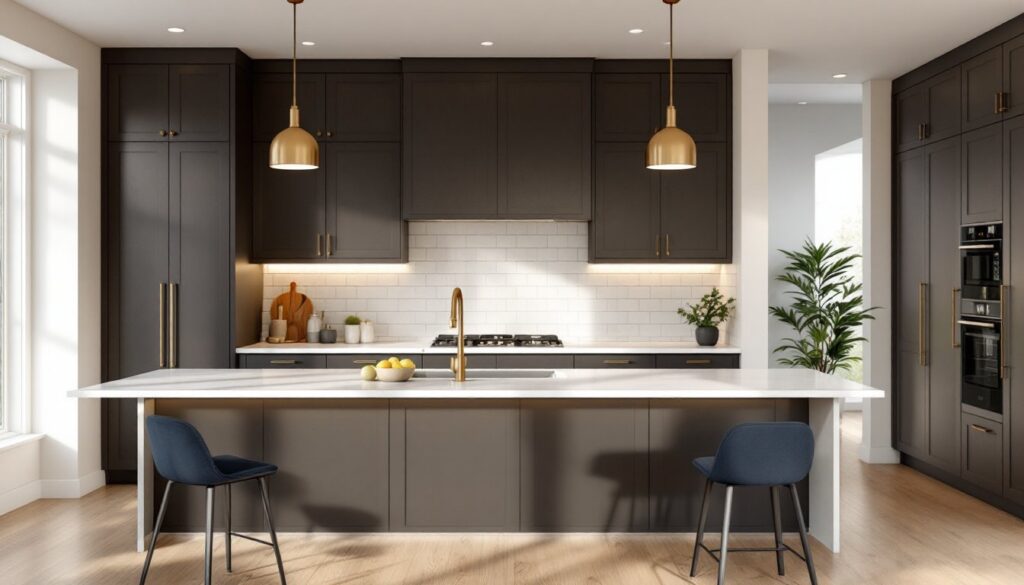
Dark espresso cabinets have cemented themselves as a kitchen staple, but choosing the right color scheme to pair with them can feel intimidating. The beauty of espresso tones lies in their versatility, they ground a space while creating a sophisticated backdrop for nearly any design direction. Whether you’re drawn to warm, inviting palettes or crisp, modern contrasts, espresso cabinets offer a rich canvas that transforms how light, texture, and color interact in your kitchen. This guide walks through proven color combinations that work with espresso cabinetry, plus practical strategies for making them feel balanced rather than cave-like.
Table of Contents
ToggleKey Takeaways
- Espresso color schemes balance dark cabinets by pairing them with light walls, countertops, and flooring to prevent visual heaviness and create intentional design.
- Warm neutrals like cream, off-white, and warm gray are the most forgiving approach for espresso kitchens, amplifying natural light and creating sophisticated contrast.
- Bold accent colors such as navy, forest green, and terracotta add personality when used strategically on about 20–30% of visual space, paired with light walls and abundant lighting.
- Layer lighting with recessed ceiling lights, under-cabinet LED strips (warm white at 3000K), and pendant fixtures to brighten dark kitchens and reduce shadows on work surfaces.
- Light countertops and flooring are essential with espresso cabinets—choose light quartz, marble, light tile, or lighter wood to balance the overall kitchen and prevent a top-to-bottom dark aesthetic.
- Test color choices with large paint samples in your actual kitchen under different lighting conditions before committing, and invest in professional cabinet refinishing prep work for lasting results.
Why Espresso Tones Work With Dark Cabinets
Espresso is a deep, warm brown, think strong coffee, that sits between pure black and standard dark wood. Unlike black cabinets that can feel harsh, espresso carries warmth and depth, making it forgiving when layering colors. Dark cabinets also serve a practical purpose: they hide spills, stains, and dust far better than light finishes, which matters in a kitchen where grease and moisture are facts of life.
The real advantage of espresso is that it doesn’t demand a specific era or style. It works equally well in transitional spaces (bridging traditional and modern), farmhouse kitchens, and industrial setups. The color absorbs light, which is why many homeowners worry about their kitchen feeling dark, a concern you’ll address with strategic lighting and surrounding colors. When done right, espresso cabinets create drama and definition rather than gloom.
Warm Neutrals: Creating Balance and Depth
Pairing espresso cabinets with warm neutrals is the most forgiving approach. Soft creams, warm beiges, and light taupes brighten the space without competing with the cabinets. The key is contrast: if your cabinets are very dark, your walls or backsplash should be noticeably lighter to prevent visual heaviness.
Cream and off-white work beautifully, especially in spaces with good natural light. These neutrals amplify whatever light enters the kitchen and make espresso cabinets feel intentional rather than dark. Warm grays are another option, they’re less stark than cool grays and feel more connected to the espresso without blending into it.
For backsplashes, white subway tile, cream-colored stone, or even light wood shiplap all perform well. A light countertop (marble, quartz, or even light granite) acts as a buffer between the dark cabinets below and lighter walls above. This layering, dark, light, dark, creates visual rhythm and prevents the eye from landing only on the cabinets. Contemporary kitchens often use a creamy or white backsplash with light quartz counters, while transitional designs might incorporate a light wood tone in shelving or open cabinetry to echo warmth.
Bold Accent Colors to Pair With Espresso
If you want personality beyond neutrals, bold accents can transform an espresso kitchen from standard to stunning. Navy blue, forest green, and even terracotta work as secondary colors without overwhelming the space. The trick is using them as accents, an accent wall, bar stools, open shelving, or tile details, rather than dominating the entire kitchen.
Navy pairs exceptionally well with espresso because both are sophisticated darks that feel cohesive. A navy accent wall paired with white trim and light counters creates a classic, upscale look. Forest green brings organic warmth: it’s especially effective in kitchens with brass or gold hardware and warm wood open shelving. Terracotta or warm rust tones echo the warmth in espresso while adding Mediterranean or Southwest influence.
When kitchen design trends lean toward maximalism, jewel tones like emerald or sapphire appear on open shelving or as painted cabinet interiors visible through glass doors. Keep these bolder choices to about 20–30% of your visual space. Pair them with white or cream walls and abundant light to prevent the kitchen from feeling too enclosed. Brass or brushed gold hardware amplifies warmth, while matte black hardware keeps things modern and sharp.
Lighting Strategies to Brighten Your Dark Kitchen
The biggest complaint about dark kitchens is insufficient light, both practical and perceived. Layer your lighting with recessed ceiling lights as your baseline, under-cabinet task lighting for work surfaces, and pendant or decorative fixtures for ambiance and style. Recessed lights should be on a dimmer so you can adjust brightness depending on time of day and activity.
Under-cabinet LED strips are a game-changer. They illuminate your countertop workspace, reduce shadows, and create visual separation between the dark cabinets and light countertop. Warm white LEDs (around 3000K color temperature) look friendlier than cool white and complement espresso’s warmth. Position them toward the front edge of the cabinet to bounce light onto the counter rather than the backsplash.
Pendant lights hanging over an island or peninsula add both task and ambient light while creating focal points that draw the eye away from the cabinets’ darkness. Choose fixtures with shades that direct light downward and outward, open-bottomed pendants or ribbed shades work well. Reflective finishes (stainless steel, polished chrome, or brushed gold) bounce light around the room. Glass backsplashes, glossy tile, or polished countertops also help bounce light, while matte finishes absorb it.
Flooring and Countertop Pairings for Espresso Schemes
Your flooring and countertops anchor the entire kitchen’s visual weight. With espresso cabinets above, choose countertops and floors that provide contrast and prevent a top-to-bottom dark effect.
Countertops: Light quartz, marble, or white granite sit above espresso cabinets to create visual separation and brightness. Waterfall edges (where countertop material wraps down the side of an island) can blur this contrast, so reserve them for lighter materials. Warm wood countertops work too, especially if they’re noticeably lighter than the espresso, they echo the cabinet material but add warmth without doubling down on darkness. Butcher block is a budget-friendly option that feels warm and lived-in.
Flooring: Lighter woods, light tile, or concrete work well. Light oak, ash, or whitewashed wood prevents the kitchen from feeling bottom-heavy when paired with dark cabinets. Large-format light tile (18″ × 18″ or bigger) feels more contemporary and visually expands smaller kitchens. Avoid dark flooring paired with dark cabinets unless your kitchen has exceptional natural light and you’re aiming for a moody, upscale aesthetic. Medium-toned concrete or polished concrete can work in modern or industrial settings if it’s matte to avoid excessive glare.
When exploring 20 kitchens with dark cabinets, you’ll notice that nearly all feature light countertops and flooring to balance the cabinetry. This isn’t arbitrary, it’s a visual principle that keeps the space from feeling cramped.
Practical Tips for Implementing Your Design
Before committing to espresso cabinets or a full recolor, gather inspiration and test your vision. Create a mood board with paint samples, countertop swatches, and flooring options. View them together in your actual kitchen at different times of day, morning light, afternoon light, and evening with artificial lights on. Colors shift dramatically depending on lighting, and what looks perfect at the showroom may disappoint at home.
If you’re repainting existing cabinetry espresso, prep work is non-negotiable. Sand the current finish thoroughly, fill any gaps or imperfections, apply a quality primer, and use cabinet-grade paint (not regular wall paint). Two coats minimum. This is a job worth outsourcing if you’re not confident, professional cabinet refinishing runs $1,500–$5,000 depending on kitchen size and finish quality, but it’s cheaper than new cabinetry and transforms the space.
For wall colors, paint large samples (18″ × 24″ minimum) and live with them for a few days. A cream that looks perfect indoors might look yellow under certain lighting. Warm grays can read too purple or too beige depending on undertones. Brands like Benjamin Moore and Sherwin-Williams offer detailed undertone descriptions, use these to avoid costly mistakes.
When selecting hardware, finish, and fixtures, bring paint and countertop samples to the hardware store. Espresso pairs well with brushed gold, warm brass, oil-rubbed bronze, and matte black. Shiny chrome can feel cold against espresso’s warmth. Keep kitchen remodeling ideas grounded in your home’s existing style rather than chasing trends that might feel dated in a few years. Espresso itself is timeless, so anchor your other choices in classic pairings.
Conclusion
Espresso cabinets are a bold, sophisticated choice that rewards thoughtful color planning. Balance dark cabinetry with light walls, adequate lighting, and contrast in your countertops and flooring. Whether you choose warm neutrals for timeless calm or bold accents for personality, the principle remains: use lighter and brighter elements to frame the darkness. The result is a kitchen that feels intentional, dramatic, and decidedly grown-up, not dim or unwelcoming. Start with inspiration from established sources like Remodelista, test your choices thoroughly, and don’t rush the planning phase. Your future self will appreciate the effort.