Harmony in interior design isn’t about matching everything or creating a sterile showroom that no one dares to live in. It’s the feeling of intentional balance, where colors complement rather than clash, where furniture scales fit the room, and where every element serves a purpose without competing for attention. A harmonious space feels calm and put-together, even if it’s styled on a budget or filled with hand-me-downs and DIY projects. Whether you’re refreshing a single room or overhauling your whole home, understanding how to layer harmony into your design decisions transforms spaces from chaotic to cohesive. Let’s walk through the practical steps to get there.
Table of Contents
ToggleKey Takeaways
- Harmony in interior design means creating visual and spatial unity through intentional choices about color, furniture, texture, and proportion—not about matching everything perfectly.
- Use the 60-30-10 color rule: 60% dominant color, 30% secondary color, and 10% accent colors, repeating each hue at least twice throughout the room for cohesion.
- Match furniture scale to room size and arrange pieces to create better flow; avoid cramping oversized furniture into small spaces or leaving empty rooms with undersized pieces.
- Layer three types of lighting—ambient, task, and accent—and adjust the 60-30-10 brightness principle to make rooms feel balanced and intentional.
- Limit patterns to 2-3 in small rooms or 4 in larger spaces, ensuring they share colors or undertones, and anchor patterned pieces with solid-colored furniture to help the eye rest.
- Apply room-specific harmony: bedrooms need calm limited palettes, kitchens benefit from repeated materials and finishes, and living areas can support slightly more complexity through consistent repetition.
What Is Harmony in Interior Design?
Harmony in interior design means creating visual and spatial unity through thoughtful choices about color, furniture, texture, and proportion. It’s the opposite of random decorating, where every piece looks like it wandered in from a different room. Think of it like composing music: each instrument plays its part, but they work together toward one cohesive sound.
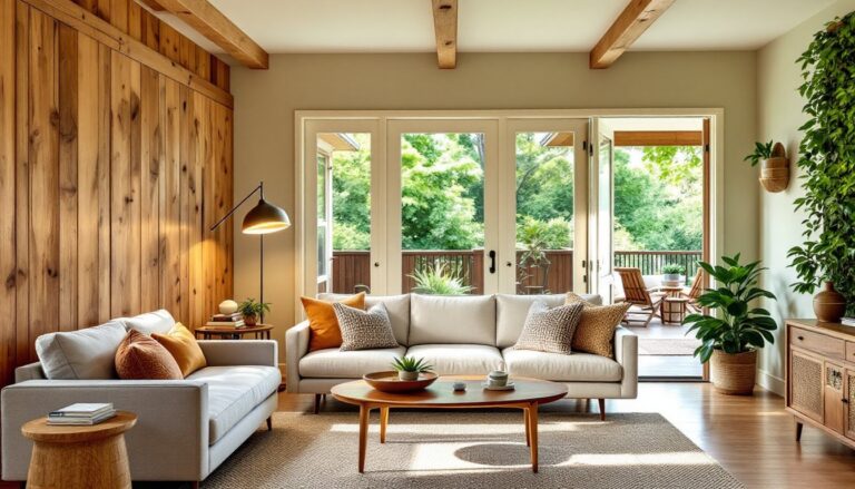
When a room has harmony, your eye doesn’t jolt from one jarring element to another. Instead, it travels smoothly across the space, noticing intentional connections. A harmonious living room might repeat the same warm neutral tone in the walls, sofa, and area rug, then introduce visual interest through varying textures, linen, wood, metal, and a few accent colors pulled from the same palette.
What does harmony mean in interior design at its core? It’s the principle that ties a room together so it feels complete rather than ad-hoc. Whether you’re working with elegant interior styling on a tight budget or building from scratch, harmony is the foundation that makes everything else look intentional and polished.
The Role of Color in Creating Balance
Color is the quickest way to establish (or destroy) harmony in a room. The trick isn’t painting every wall beige, it’s understanding how colors relate to each other and how they make the space feel.
Start with a dominant color that covers roughly 60 percent of the room. This is usually your walls, large furniture pieces, or flooring. Lighter neutrals (whites, creams, soft grays) make a room feel open and calm: darker tones (charcoal, navy, forest green) add sophistication and coziness. Next, choose a secondary color for about 30 percent of the visual space, throw pillows, a rug, or painted accent wall. This color should complement your dominant tone without clashing.
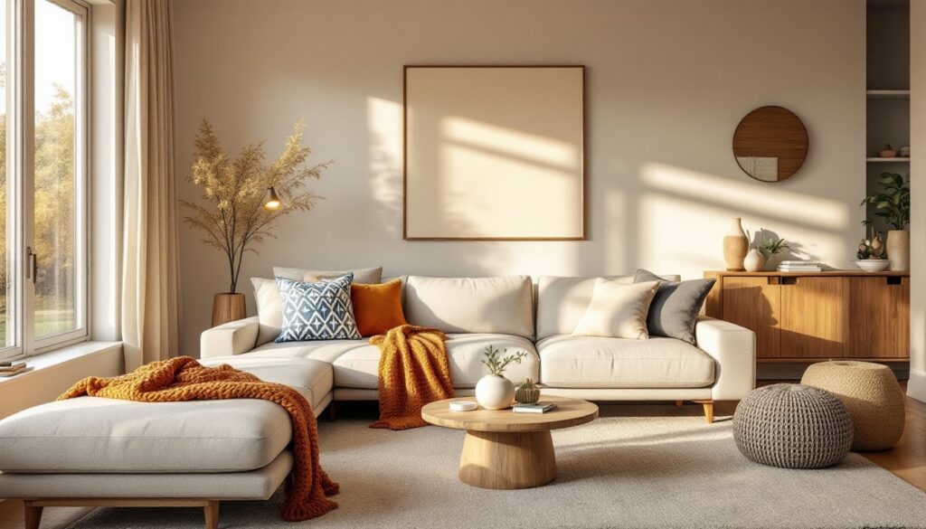
Finally, introduce accent colors in roughly 10 percent of the room. These are your pops of visual interest: a bright throw blanket, artwork, plants, or decorative objects. The golden rule? Repeat each color at least twice in the room so it doesn’t feel random. If you use a burnt orange in artwork, echo it in a cushion or small decor piece elsewhere.
Designers explain that achieving harmony through color balance creates a sense of visual rest. You don’t need a trendy color palette, warm grays paired with whites and soft wood tones work just as well as any Instagram-worthy combination. The key is consistency and repetition.
Balancing Furniture and Space
A cramped room stuffed with oversized furniture or an empty space with too-small pieces both feel off-balance. Harmony requires matching furniture scale to room size and arranging pieces so the space breathes.
Measure your room and any existing furniture before buying. A sofa shouldn’t consume more than two-thirds of your wall length, and it should sit at a comfortable distance from a seating surface across from it (typically 8 to 10 feet for conversation). Floating furniture in the middle of the room rather than pushing everything against walls creates better flow and makes smaller spaces feel less cramped.
Arrangement matters as much as size. In family room design, anchor the space with a focal point, fireplace, large window, or TV wall, then arrange seating to face or relate to that anchor. Use occasional tables, consoles, or shelving to create secondary anchors that support visual balance. If your sofa is on the left side of the room, don’t pile everything else on the right: instead, distribute visual weight across the space with a bookshelf here, a plant there, and artwork on multiple walls.
The “rule of threes” helps maintain balance: group objects in odd numbers and vary their heights. Three throw pillows of different sizes on a bed look intentional: two can feel accidental, and four starts to look cluttered.
Using Texture and Pattern Harmoniously
Texture and pattern add depth and interest without disrupting harmony, if they’re chosen with restraint and repetition. Too many competing patterns make a room feel chaotic: too little texture makes it feel flat and cold.
When selecting textures, aim for a mix of smooth, rough, and soft surfaces. Pair a sleek glass or metal side table with a chunky knit throw and a plush rug. Wood, whether rough-hewn or polished, bridges styles and adds warmth. Linen, wool, leather, and cotton each bring different tactile qualities. Mixing them creates visual interest without clashing.
For patterns, stick to two or three maximum in a small room, perhaps four in a larger space. They should share a color or undertone so they feel connected. For example, a striped rug and a geometric throw pillow both in blue and white won’t compete because they speak the same color language. Alternate between large-scale and small-scale patterns, a big geometric rug pairs well with delicate stripes or smaller prints. Expert tips on interior harmony emphasize that patterned pieces should be anchored by solid-colored furniture so the eye has somewhere to rest.
One practical trick: if you’re unsure about mixing patterns, pair one patterned piece with mostly solids. A patterned accent wall or curtains surrounded by neutral furniture reads as cohesive, not chaotic.
Lighting and Proportion: Two Essential Elements
Lighting dramatically affects how a room feels, and poor lighting undermines even the best color and furniture choices. Harmony requires three types of lighting: ambient (overall room light), task (reading or cooking), and accent (highlighting features).
Ambient light typically comes from overhead fixtures or wall sconces. Task lighting means table lamps on nightstands or reading chairs, under-cabinet lights in kitchens, or a desk lamp in a home office. Accent lighting draws attention to artwork, architectural details, or statement pieces. When all three layers are present and can be adjusted, a room feels balanced and intentional rather than either too bright or too dark.
Proportion refers to how sizes and shapes relate to each other and to the room itself. A spindly side table next to a massive sofa looks out of proportion: instead, choose a table with presence that balances the sofa’s scale. Light fixtures should match the room, a tiny pendant in a large kitchen disappears, while an oversized chandelier in a small bedroom overwhelms. Artwork should relate to the wall or furniture it hangs above: a small print gets lost above a large sofa, but a collection of smaller pieces arranged in a grid can balance the same wall.
The 60-30-10 color rule mentioned earlier works for brightness too: 60 percent ambient light creates the baseline, 30 percent task lighting adds function, and 10 percent accent lighting creates visual focus. This layered approach makes rooms feel complete and harmonious rather than one-note.
Applying Harmony Across Different Rooms
Every room benefits from harmony, but the specifics shift based on function. A bedroom prioritizes calm and comfort: a kitchen needs clarity and functionality: a living room balances socializing with relaxation.
In bedrooms, a limited color palette (typically two to three tones) promotes restfulness. Modern interior design often strips things down to essentials: a neutral wall, quality bedding in complementary tones, simple nightstands, and minimal artwork. The goal is visual peace so your brain can genuinely rest.
Kitchens and bathrooms benefit from harmony through repeated materials and finishes. If your cabinet hardware is brushed nickel, echo it in faucet finishes and light fixtures. Kitchen counters, backsplash, and flooring don’t all need to match, but they should share an undertone, warm woods with warm metals, cool whites with chrome. Styles like Scandinavian design and Japandi excel at harmony because they intentionally limit materials and maintain consistency throughout.
Living and dining areas are often on display, so harmony here affects the overall impression of your home. These rooms are where you can afford slightly more complexity, perhaps an accent wall, more varied textures, or a secondary color scheme, because they’re less intimate than bedrooms. The key is still repetition: if you introduce sage green as an accent, let it appear on curtains, a throw pillow, and perhaps a wall, not just once. This creates cohesion.
Offices and home studios need functional harmony: task lighting that doesn’t create glare, colors that support focus (avoid overstimulation), and storage that keeps clutter hidden. A well-organized home office with neutral walls and coordinated furniture feels more harmonious than one buried in stacks of papers and mismatched shelving.
Conclusion
Achieving harmony in interior design is about making thoughtful, repeating choices rather than chasing trends or matching everything perfectly. Focus on unifying color, balancing scale, layering texture, and lighting intentionally. Start with one room, observe how colors, proportions, and textures interact, then apply those lessons elsewhere. A harmonious home invites relaxation, supports daily life, and reflects intention. That’s worth the planning.