Dark interior design has evolved from a risky gamble into a go-to strategy for creating sophisticated, welcoming homes. When done right, dark colors, deep charcoals, forest greens, navy, and warm blacks, add depth, drama, and a sense of luxury without feeling cold or gloomy. The key is understanding that dark doesn’t mean small, sad, or depressing. It means intentional. Homeowners and designers are ditching the myth that every room needs beige walls and bright overhead lighting. Instead, they’re discovering that a well-executed dark palette, balanced with the right lighting and decor choices, transforms a space into something that feels both intimate and inviting. This guide walks you through the practical side of dark interior design, why it works, how to choose your colors, and how to avoid the pitfalls that make dark rooms feel like caves.
Table of Contents
ToggleKey Takeaways
- Dark interior design creates sophisticated, intimate spaces when balanced with proper lighting, layered textures, and warm color tones rather than appearing cold or gloomy.
- Choosing the right dark palette requires testing paint samples in your actual room across different times of day, prioritizing warm undertones (charcoal, olive, chocolate) over cool darks unless supplemented with warm lighting.
- Layered lighting with warm bulbs (2700K), combined with reflective surfaces and natural textures like wood and linen, is essential to prevent dark rooms from feeling cave-like.
- Dark interior design works across all room types when executed intentionally—bedrooms benefit from naturally relaxing qualities, while living areas and kitchens demand careful balance with accent walls and strategic lighting.
- Common mistakes that undermine dark interior design include inadequate lighting, skipping wall prep, choosing the wrong paint finish, and neglecting textures that soften and warm the space.
- All-dark rooms create a boxed-in feeling; maintaining contrast through lighter ceilings, accent walls, and light furnishings ensures dark palettes feel inviting rather than depressing.
Why Dark Colors Work in Modern Home Design
Dark interiors aren’t a trend, they’re a shift in how people think about home comfort. Psychologically, dark colors create a sense of enclosure and intimacy. They make a room feel like a sanctuary rather than just a place to pass through. Unlike the open-concept-everything mantra of the 2010s, homeowners are now reclaiming smaller, intentional spaces.
From a design perspective, dark walls have serious advantages. They highlight artwork, architectural details, and decorative objects. A navy wall becomes the perfect backdrop for a gold-framed mirror or floating shelves. Dark colors also hide imperfections better than light ones, no more obsessing over every dust particle on a white wall. On the practical side, they’re forgiving. A dark charcoal living room won’t show the dust that settles on surfaces the way a light gray does.
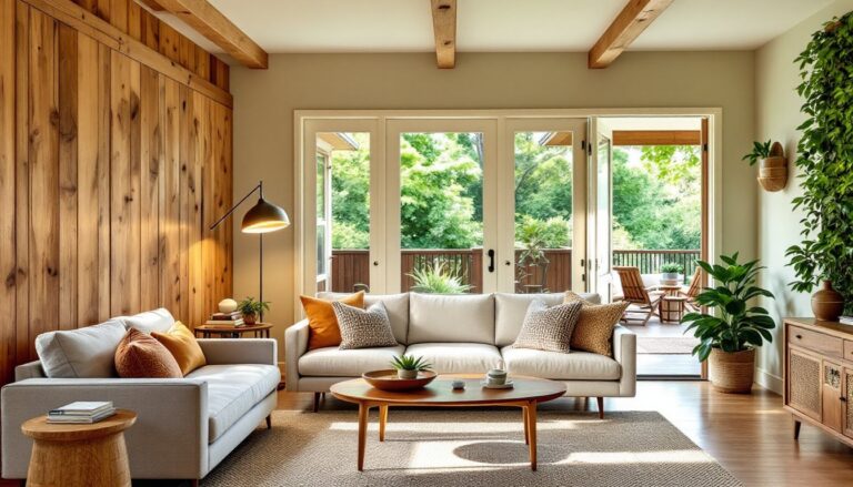
Dark colors also provide flexibility. They work with almost any design style, minimalist, industrial, traditional, or eclectic. Whether you’re leaning into modern interior design principles or exploring elegant interior styling, dark palettes adapt to your vision. They’re also a smart long-term choice. While trends shift, dark walls feel timeless and won’t feel dated in five years the way some trendy colors do.
Choosing the Right Dark Palette for Your Space
Not all dark colors are created equal, and choosing the wrong shade is where most projects stumble. The first rule: paint samples on your walls in the actual room you’re painting. Lighting varies dramatically by room and time of day, and what looks sophisticated in a showroom might feel depressing at 6 p.m. in your living room.
Warm dark colors, charcoal with brown undertones, deep olive, rich chocolate, feel more inviting than cool darks. Cool darks like pure navy or slate work beautifully in bedrooms and bathrooms but can feel sterile in living areas without proper lighting and warm textures. Think about undertones carefully. A true black has no warmth: a charcoal gray usually carries brown or warm undertones that make it feel less harsh.
Consider your room’s natural light. North-facing rooms (cooler light throughout the day) can handle cooler darks, but they’ll need supplemental warm lighting. South-facing spaces can go deeper without risk. A practical tip: take a paint sample home and look at it in morning, afternoon, and evening light for at least three days before committing.
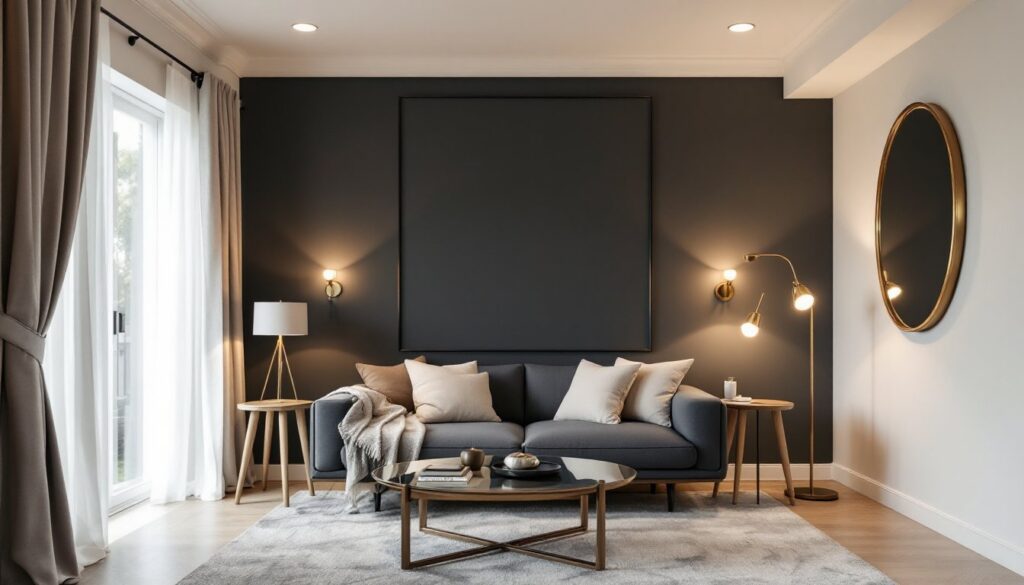
If you’re uncertain, start with dark accent walls rather than painting an entire room. One dark wall with three light walls lets you test the waters. You can also explore interior design styles to see how professionals combine dark colors within different aesthetic frameworks, giving you confidence in your color choices.
Balancing Dark Walls With Lighting and Decor
This is the make-or-break step. A dark room needs light, not just overhead fixtures, but layered lighting that creates warmth and prevents the space from feeling like a cave. Plan for ambient, task, and accent lighting.
Ambient lighting (your base layer) works best with warm bulbs (2700K color temperature mimics warm incandescent light). Recessed lights alone won’t cut it: add table lamps, wall sconces, or floor lamps to soften the shadows that dark walls can create. Task lighting handles specific areas, reading nooks, kitchen counters, desks. Accent lighting highlights artwork or architectural features and adds visual interest.
Texture and material choices matter enormously. Dark matte paint absorbs light and can feel heavy: adding texture, through rugs, pillows, woven wall hangings, or wallpaper with subtle patterns, keeps the space from feeling flat. Incorporate reflective surfaces strategically. A brass floor lamp or a glass-topped table bounces light around the room. Light wood furniture or whitewashed pieces contrast beautifully against dark walls without fighting them.
Warm metallics (brass, copper, warm gold) feel more cohesive in dark rooms than chrome or silver, which can feel cold. Textiles are your ally: linen curtains, wool rugs, cotton throw pillows. The combination of dark walls, warm light, and natural textures is what separates a sophisticated dark room from a gloomy one. Most DIYers find that adding layers of lighting and softening materials takes two or three tries to get right, don’t expect perfection on the first pass.
Dark Design in Different Rooms
Bedrooms and Living Areas
Bedrooms are ideal candidates for dark colors because the goal is relaxation and rest. Dark walls naturally encourage winding down. Pair a deep charcoal or navy wall with soft layered lighting, a bedside lamp on each nightstand, a dimmer-controlled ceiling fixture, and perhaps a wall sconce. Bedding in cream, soft gray, or light naturals creates contrast. Avoid dark bedding on dark walls unless you want the space to feel cave-like.
Living areas demand more careful balance. Dark walls work here when you’re intentional about traffic flow, seating arrangement, and lighting zones. A living room with one dark accent wall (often behind the sofa) combined with three light walls is a safer entry point than going fully dark. This approach gives you drama and sophistication without the risk. Layer in interior design tips that emphasize good lighting placement, lamps flanking a sofa, floor lamps in corners, table lamps on side tables.
Kitchens and Bathrooms
Kitchens are trickier because they demand function and safety. Dark walls can work if your cabinetry is light or neutral and your countertops provide contrast. A dark forest green accent wall with white subway tile backsplash and natural wood countertops reads as sophisticated, not cramped. Ensure task lighting is robust, under-cabinet lighting is non-negotiable. Recessed lights over the main work areas prevent shadowy corners.
Bathrooms are forgiving for dark colors because spaces are typically small and already use vapor-resistant paint. A dark charcoal or deep teal bathroom feels spa-like, especially with good ventilation and white or light gray fixtures that pop. Bathroom lighting should be bright and flattering (avoid anything too yellow or too blue). Wall sconces on either side of the mirror are standard, but add overhead lighting if possible. Research local building codes for bathroom lighting requirements: the National Electrical Code (NEC) has specific ventilation and lighting standards for bathrooms, though these vary by jurisdiction.
Avoiding Common Dark Interior Design Mistakes
Mistake 1: Skipping prep work. Dark paint shows every imperfection, dust, fingerprints, uneven wall texture. Prep your walls properly. Fill gaps, sand rough spots, and use primer. A good quality primer (like shellac-based or bonding primers for difficult surfaces) is worth the extra cost when you’re covering light walls with dark paint. Two coats of dark paint are often necessary: plan for this in your budget and timeline.
Mistake 2: Choosing the wrong finish. Flat or matte finishes look sophisticated but show dust and marks. Semi-gloss or satin finishes in dark colors can feel plastic-y. Eggshell is the sweet spot, it has slight sheen for durability without looking shiny. In kitchens and bathrooms, semi-gloss works better for moisture resistance, but test samples first.
Mistake 3: Under-lighting. This is the most common pitfall. Homeowners assume dark walls require less light: the opposite is true. You need more light sources, warmer color temperatures, and strategic placement. If you’re not comfortable adding new fixtures, hire an electrician, it’s worth it.
Mistake 4: Going all-dark. Painting all four walls, the ceiling, and the trim dark creates a box. Leave your ceiling light or white, or paint only an accent wall. Balance is key.
Mistake 5: Neglecting materials and texture. A dark room that’s all paint with zero texture feels harsh. Introduce natural materials, wood, linen, wool, rattan. These soften the darkness and add warmth. For those exploring different approaches, art deco interior design shows how metallics and geometric patterns can break up dark walls beautifully, while office interior design demonstrates how dark walls in workspaces boost focus when paired with proper lighting and materials.
Mistake 6: Ignoring finish application. Dark paint is unforgiving with application. Brush marks, roller lap marks, and uneven coverage show immediately. Use quality brushes and rollers, apply paint in thin coats, and maintain a wet edge to avoid lap marks. If you’re inexperienced, this might be worth hiring a painter, dark rooms expose amateur technique.